

About The Project
Project Reclass is a 501(c)(3) nonprofit providing education and vocational training in prisons and rehabilitation centers. Reclass had recently partnered with Howard County Corrections in Maryland and begun preparations to launch its newest curriculum, ReVision.


What’s The Issue?
Since establishing its website in 2019, Reclass’ site has had many different editors, resulting in some major structural and visual inconsistencies. Although they didn't need a complete redesign, they needed someone to fix inconsistencies and update old content.

Prototype Sneak-Peek!
Before we break down the research and design process, feel free to explore the final responsive website in Figma!
You can browse all the active pages in the navigation and fill out the new volunteer signup form on the Volunteer page.

Analyzing Other Nonprofits
To learn about UX best practices for other nonprofit websites, I analyzed Project Reclass’s current website and four other organizations with similar missions: Code Your Dreams, The Last Mile, Brave Behind Bars, and Northwest Education Fund. After some cursory research, I determined several beneficial site features, patterns, and industry trends that could help with this redesign.

Assessing Reclass’ Website
Beyond the general alignment and consistency issues, I noticed Project Reclass’s CTA in the top right corner of the navigation promoted an older curriculum that’s no longer their highest priority project. Perhaps this space would be best used to promote a higher-priority page instead, like a Donate or Get Involved page?

User Interviews
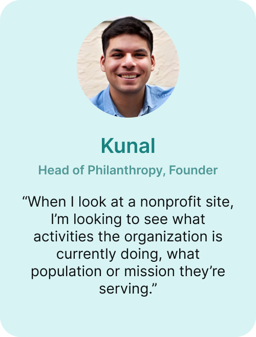
The next step was to find out what the clients’ needs and priorities were. I interviewed Project Reclass’s two cofounders, Kunal Jha and Tay Nishimura, to gather insight into the organization’s mission, values, and brand identity.
I also interviewed two other current members of the organization to learn about their experience working with Reclass and using its website. During our sessions, I encouraged participants to have the Project Reclass website open in front of them, allowing me to learn how they navigated the site in real time.


Defining The Goals
After concluding these interviews, I sorted my findings using an affinity map based on the areas where my interviewees experienced pain points, general website issues, and the organization’s identity and mission. Thanks to the insights the founders and other members provided, I determined three primary issues to tackle for this site redesign.
Project Goals

Improve the visibility of the organization’s curriculums and current partnerships

Design a way for new potential volunteers to apply through the website

Design more visible and attractive Donate page and move it to the
User Personas
I developed two user personas for the types of people I would be designing for:
The Donor and The Volunteer.
Therese: The Donor
Therese, the prospective donor, recently learned about Project Reclass. Their mission resonated with her, and she’s interested in donating to fund their work. Before making a financial contribution to the organization, she needs to feel confident that Reclass is a reputable nonprofit worth supporting.
Miles: The Volunteer
Miles, the new volunteer, is a college student seeking an internship with a nonprofit organization. He wants to contribute to an organization that’s making a difference by helping justice-involved people. He needs to know about Reclass’ mission, the work he would be doing as a volunteer, and how to join the organization.
A Better Sitemap
My first priority was redesigning Project Reclass's sitemap to match the users' mental models. Based on the clients’ wishes and other nonprofits’ best practices, I decided to place Reclass’ curriculum pages front and center on the landing page, where users can glean an overview of their outreach. These curriculum pages showcase the organization's products and outreach, so having them heavily nested in the original site’s navigation presented a major structural problem.
Improving the Navigation
Next, I created a new menu item, “Curriculums,” to house the ReVision and ToyNet curriculum page. I also moved the Team page to the “About” menu item to better align with nonprofit site users' mental models. I determined the best way to combine the two previous volunteer pages, Outreach and Technology, into one easy-to-locate “Get Involved” page. Because users are primed to scan for the Donate CTA in the top right corner of the navigation, I also replaced the previous link to the ToyNet curriculum with a link to the Donate page.
HEADING
Project Reclass established its brand identity and website in 2019. Since then, the site has had many different editors, resulting in some major structural and visual inconsistencies. Several essential pages featured alignment issues, inconsistent visual hierarchy, and old web copy that didn't fit the pages' layouts. While the client didn't need a complete website redesign, they needed help updating several key pages.